It's highly doubtful
that there are any films that everyone has seen at Sundance. But there is one
creative project that's ubiquitous here -- the festival's visual identity as
emblazoned on the covers of film guides, street maps, press kits, T-shirts and
post cards. The look changes annually, yet after the films unspool and the parties
are long over, it's the festival's print material that serves as a visual record
and resource.
Sundance's artful
2001 design identity, with a color palette of olive green and deep blue and
a nod to early 20th century Dada and Surrealism, was created by a small San
Francisco design firm known as Appetite Engineers (www.appetiteengineers.com).
Founded by Cranbrook-trained designer Martin Venezky, the company has heretofore
made it's name by creating the distinctive look of design award winning Speak
magazine (www.speakmag.com), the San Francisco Museum of Modern Art's spiffy
members' magazine, various photography books and exhibition catalogs, as well
as more corporate clients like Reebok and Warner Bros. (Venezky also teaches
graphic design at the California College of Arts and Crafts in San Francisco.)
After being scouted
out at the International Design Conference in Aspen in June 2000 where Venezky
was a featured speaker, his work was brought to the attention of Sundance founder
Robert Redford, who paid a visit to the designer's four-person studio, which
is actually a converted Victorian apartment. The actor/film visionary wasn't
exactly a typical client. "It was a chance to clean up the studio," the designer
jests between films in a Park City cafe. "I was surprised at how genuinely interested
he was in the project." After nailing down a design concept, Venezky and company
worked most closely with Sundance Institute Executive Director Ken Brecher and
Festival Co-Director Nicole Guillemet to develop the look.
The five-month
project, encompassing nearly forty printed pieces, reflects Venezky's typical
approach of lending the visuals a playful conceptual underpinning. The idea
here is that films at Sundance are made with more personal care and are more
artistically hands-on than traditional Hollywood fare. For the festival materials,
Appetite Engineers created a series of nearly 100 collages illustrating the
process of filmmaking that are literally handcrafted. Venezky and his studio
assistants created distinctive sculptures from simple objects-wire, soap, toys-which
they then photographed and used as the basis for collage compositions. These
objects serve as the festival schedule and catalog section headings, pages that
also feature typography which were cut, letter by letter, from vintage movie
magazines. While those subtle facts may not be visible to the casual viewer,
they enhance the ultimate integrity of the design
To further employ
the cinematic metaphor, the Appetite Engineers approached the project as if
making a narrative film. Each successive printed piece emulates the process
of filmmaking. The cover of the film guide, for example, features images of
creative process. Figures are carrying letters, seemingly painting walls or
engaging in various kinds of finishing touches. The image on the heftier festival
book, the culmination of all the design pieces, suggests presentation-a man
setting up a chair, people facing a black screen, clapping hands. The "actors"
in these images are friends of the designers, who acted as directors as they
posed them.
"The design is
like our own film," Venezky explains. "The story developed as we worked on it.
More and more people come together at a film festival, and it all culminates
with the actual event." The narrative that runs through the design pieces reflects
just that.
And it's all over
Sundance. "It's exciting to be surrounded by the things we've made," he says,
with genuine modesty. "It somehow makes walking around this town feel like being
in a movie."
Glen
Helfand
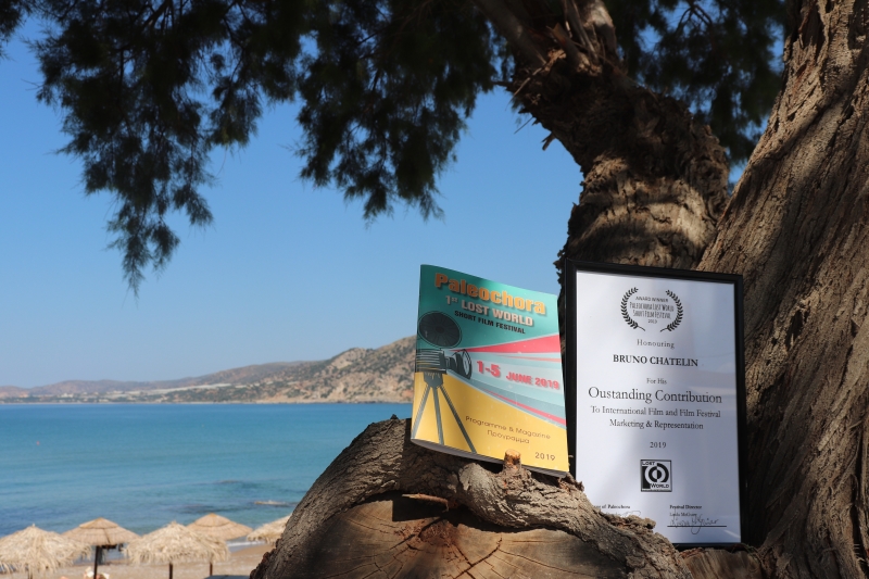
 Chatelin Bruno